Pokerology
Pokerology is a long-standing poker education platform with a deep library of lessons, articles, videos, and guides. While the content was valuable, the legacy interface made learning feel overwhelming and dated. The goal of this redesign was to modernize the experience, improve content discoverability, and create a clearer learning path, while preserving Pokerology’s credibility as a trusted educational resource.
00
Problem
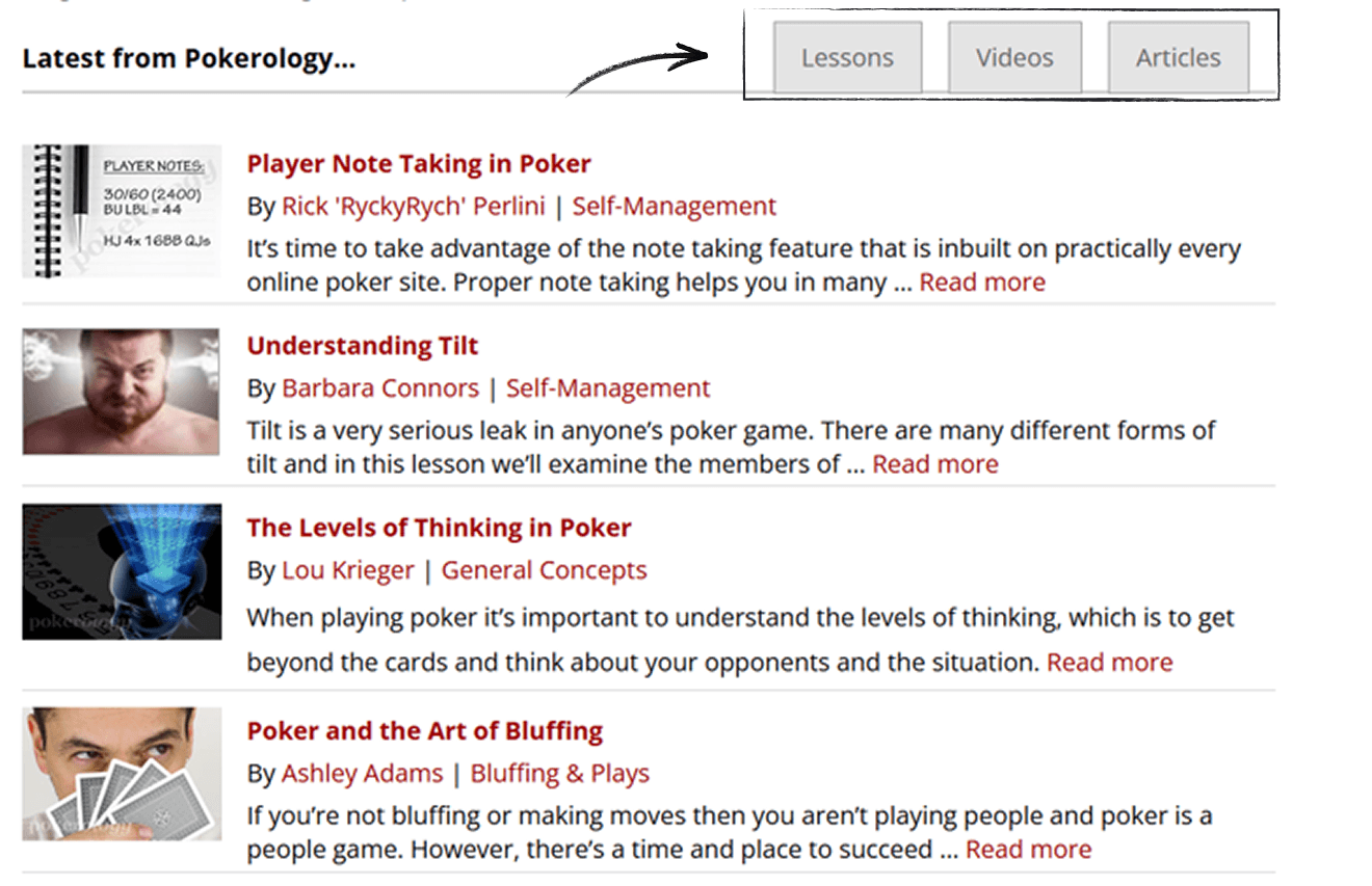
The original Pokerology interface suffered from several usability and visual issues: - A text-heavy, left-rail navigation that dominated the layout - Dense content lists with minimal visual hierarchy - No clear entry points for different learning paths - Poor scannability and weak mobile experience - Outdated visual design that reduced trust and engagement - Accessibility gaps, including contrast and readability issues Despite strong content, users had to work too hard to find where to start and how to progress.
Solution
I approached the redesign by reframing Pokerology as a learning platform, not just a content archive. The focus was on helping users quickly answer three questions: 1. What can I learn here? 2. Where should I start? 3. How do I go deeper?
Key Design Decisions
From Sidebar Navigation → Goal-Oriented Sections
The old design relied on a persistent left navigation with long lists of links. In the new design, navigation is reorganized into clear content sections (Lessons, Videos, News, Guides), supported by a simplified top navigation.
This shift reduces cognitive load and aligns navigation with user intent rather than internal structure.
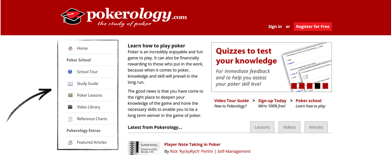
Old navigation
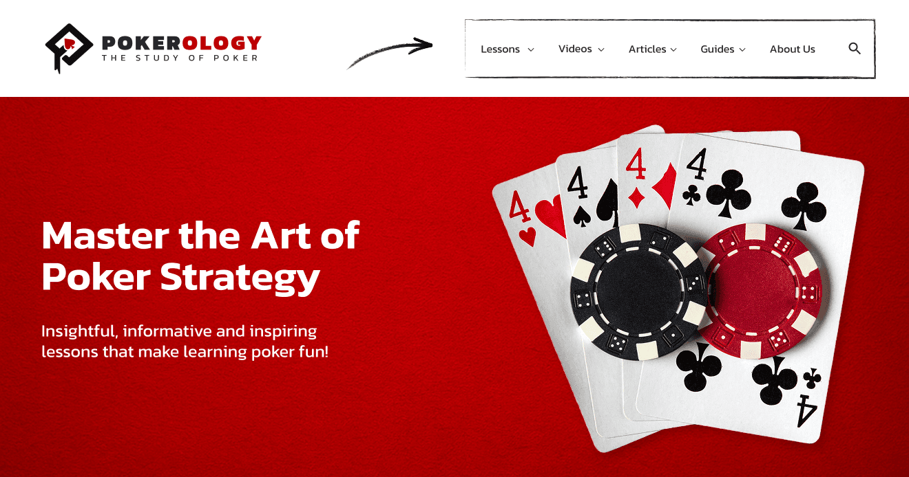
New Navigation
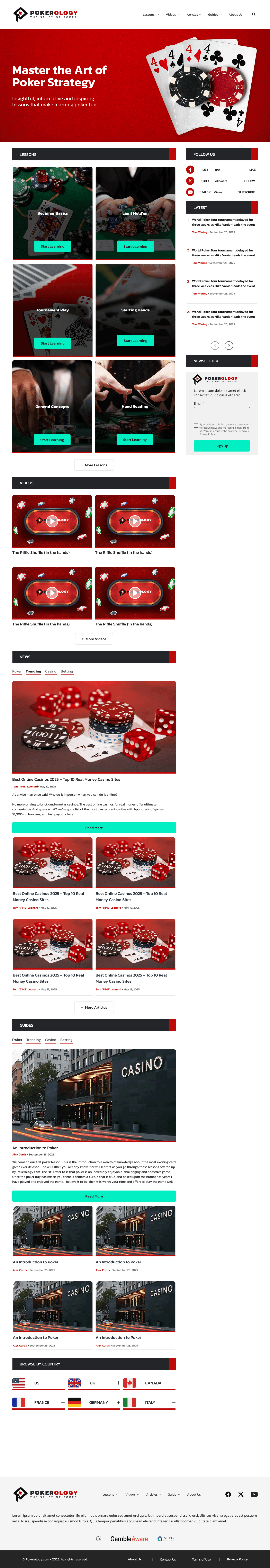
Visual Hierarchy Through Card-Based Layouts
Instead of stacked text links, the new design introduces large, visual content cards for lessons and articles. Each card clearly communicates:
Topic or learning category
Entry-level relevance (e.g., Beginner Basics, Tournament Play)
Clear call-to-action (“Start Learning”)
This makes the homepage scannable and encourages exploration.
Old visual
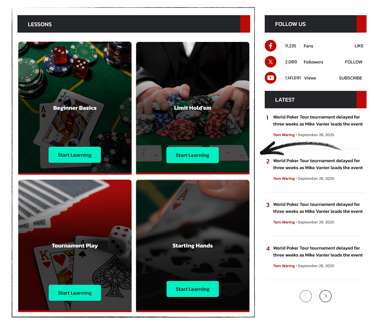
New visual
Clear Learning Entry Points
The redesigned homepage emphasizes starting points rather than the latest content alone. Lesson categories are visually prioritized, helping new users immediately understand where to begin without reading long explanations.
Modernized Visual System
The new design uses:
A stronger typographic hierarchy
High-contrast CTAs
Consistent spacing and grid alignment
A more contemporary red-and-dark theme
These changes modernize the brand while maintaining Pokerology’s established identity.
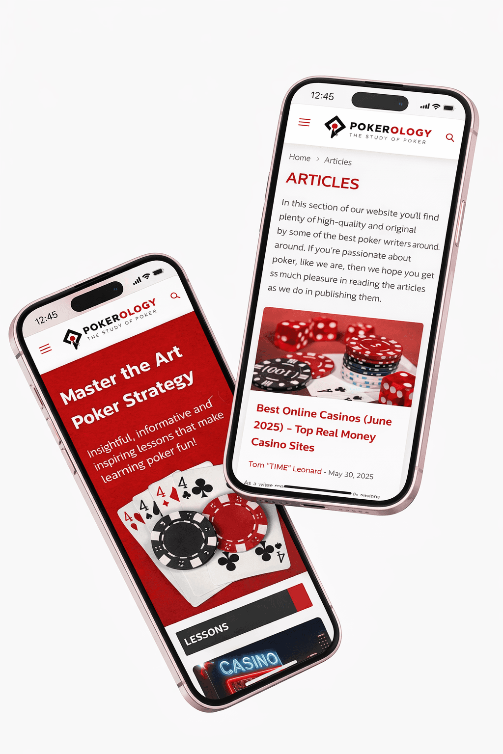
Improved Mobile & Accessibility Experience
The redesign improves usability across devices by:
Increasing tap targets
Improving text contrast and readability
Structuring content for vertical scrolling
Reducing reliance on small text links
Accessibility considerations were incorporated to meet modern usability standards.
See the new website here: https://www.pokerology.com/
year
2025
timeframe
UX/UI Designer
tools
Figma, Photoshop
category
UI/UX
01

02
see also